Android studio 4 Building user Interface in the app
Build a Simple User Interface
This lesson teaches you to
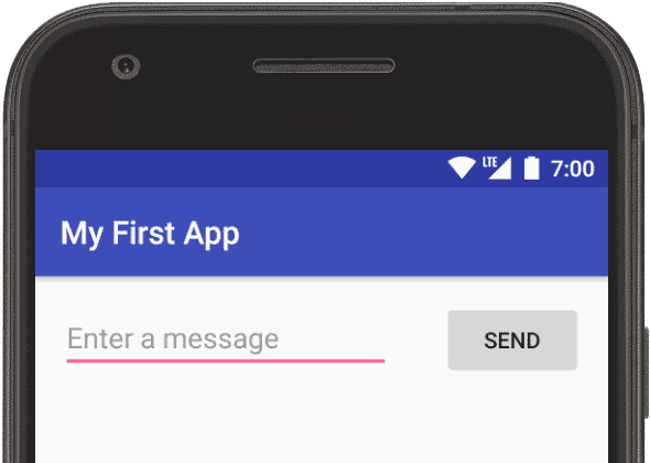
Figure 1. Screenshot of the final layout
The user interface for an Android app is built using a hierarchy of layouts (ViewGroup objects) and widgets (View objects). Layouts are invisible containers that control how its child views are positioned on the screen. Widgets are UI components such as buttons and text boxes.  Figure 2. Illustration of how
 ViewGroup objects form branches in the layout and contain View objects Android provides an XML vocabulary for
ViewGroup and View classes, so most of your UI is defined in XML files. However, instead of teaching you to write some XML, this lesson shows you how to create a layout using Android Studio's Layout Editor, which makes it easy to build a layout by drag-and-dropping views. This lesson expects that you are using Android Studio 3.0 or higher and you've followed the previous lesson to create your Android project.
Open the Layout Editor
To get started, set up your workspace as follows:
- In Android Studio's Project window, open app > res > layout > activity_main.xml.
- To make more room for the Layout Editor, hide the Project window by selecting View > Tool Windows > Project (or click Project
 on the left side of Android Studio).
 - If your editor shows the XML source, click the Design tab at the bottom of the window.
- Click Select Design Surface
 and select Blueprint.
 - Click Show
 in the Layout Editor toolbar and make sure Show Constraints is checked.
 - Make sure Autoconnect is off. The tooltip in the toolbar should read Turn On Autoconnect
 (because it's now off).
 - Click Default Margins
 in the toolbar and select 16 (you can still adjust the margin for each view later).
 - Click Device in Editor
 in the toolbar and select 5.5, 1440 × 2560, 560dpi (Pixel XL).
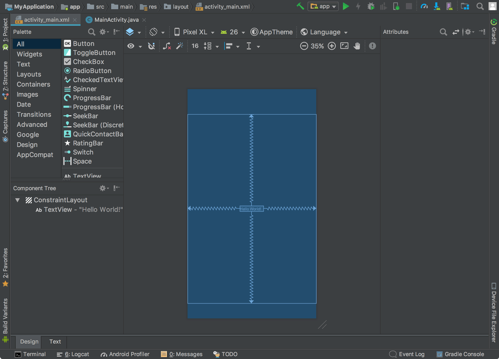
Figure 3. The Layout Editor showing
For additional information, see the introduction to the Layout Editor. activity_main.xml The Component Tree window on the bottom-left side shows the layout's hierarchy of views. In this case, the root view is a
ConstraintLayout, containing just one TextView object.ConstraintLayout is a layout that defines the position for each view based on constraints to sibling views and the parent layout. In this way, you can create both simple and complex layouts with a flat view hierarchy. That is, it avoids the need for nested layouts (a layout inside a layout, as shown in figure 2), which can increase the time required to draw the UI. 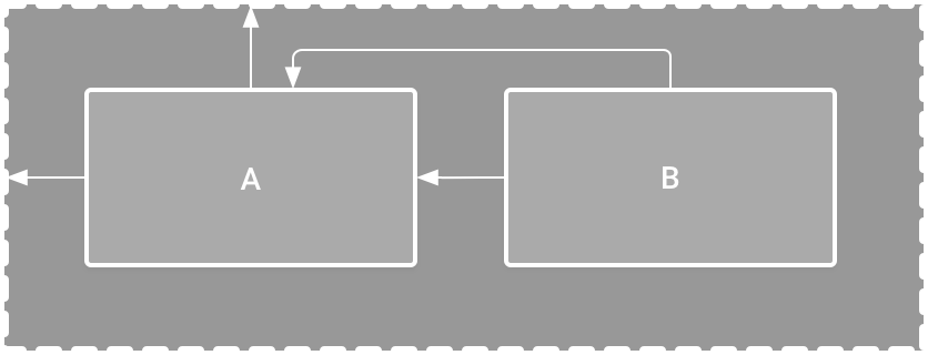
Figure 4. Illustration of two views positioned inside
ConstraintLayout- View A appears 16dp from the top of the parent layout.
- View A appears 16dp from the left of the parent layout.
- View B appears 16dp to the right of view A.
- View B is aligned to the top of view A.
Add a text box
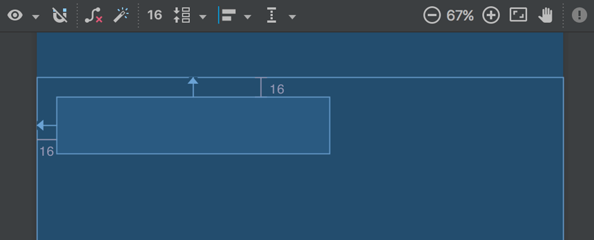
Figure 5. The text box is constrained to the top and left of the parent layout
- First, you need to remove what's already in the layout. So click TextView in the Component Tree window, and then press Delete.
- In the Palette, click Text to show the available text controls.
- Drag Plain Text into the design editor and drop it near the top of the layout. This is an
EditTextwidget that accepts plain text input. - Click the view in the design editor. You can now see the resizing handles on each corner (squares), and the constraint anchors on each side (circles). For better control, you might want to zoom in on the editor using the buttons in the Layout Editor toolbar.
- Click-and-hold the anchor on the top side, and then drag it up until it snaps to the top of the layout and release. That's a constraint—it specifies the view should be 16dp from the top of the layout (because you set the default margins to 16dp).
- Similarly, create a constraint from the left side of the view to the left side of the layout.
Add a button
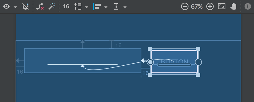
Figure 6. The button is constrained to the right side of the text box and its baseline
- In the Palette, click Widgets.
- Drag Button into the design editor and drop it near the right side.
- Create a constraint from the left side of the button to the right side of the text box.
- To constrain the views in a horizontal alignment, you need to create a constraint between the text baselines. So click the button, and then click Edit Baseline
 , which appears in the design editor directly below the selected view. The baseline anchor appears inside the button. Click-and-hold on this anchor and then drag it to the baseline anchor that appears in the text box.
Note: You can also create a horizontal alignment using the top or bottom edges, but the button includes padding around its image, so the visual alignment is wrong if you align these views that way.
Change the UI strings
To preview the UI, click Select Design Surface
in the toolbar and select Design. Notice that the text input is pre-filled with "Name" and the button is labeled "Button." So now you'll change these strings.- Open the Project window and then open app > res > values > strings.xml. This is a string resources file where you should specify all your UI strings. Doing so allows you to manage all UI strings in a single location, which makes it easier to find, update, and localize (compared to hard-coding strings in your layout or app code).
- Click Open editor at the top of the editor window. This opens the Translations Editor, which provides a simple interface for adding and editing your default strings, and helps keep all your translated strings organized.
- Click Add Key

Figure 7. The dialog to add a new string to create a new string as the "hint text" for the text box.
 - Enter "edit_message" for the key name.
- Enter "Enter a message" for the value.
- Click OK.
- Add another key named "button_send" with a value of "Send".
- Click the text box in the layout and, if the Attributes window isn't already visible on the right, click Attributes
 on the right sidebar.
 - Locate the text property (currently set to "Name") and delete the value.
- Locate the hint property and then click Pick a Resource
 to the right of the text box. In the dialog that appears, double-click on edit_message from the list.
 - Now click the button in the layout, locate the text property (currently set to "Button"), click Pick a Resource , and then select button_send.
Make the text box size flexible
To create a layout that's responsive to different screen sizes, you'll now make the text box stretch to fill all remaining horizontal space (after accounting for the button and margins).
Before you continue, click Show
in the toolbar and select Blueprint.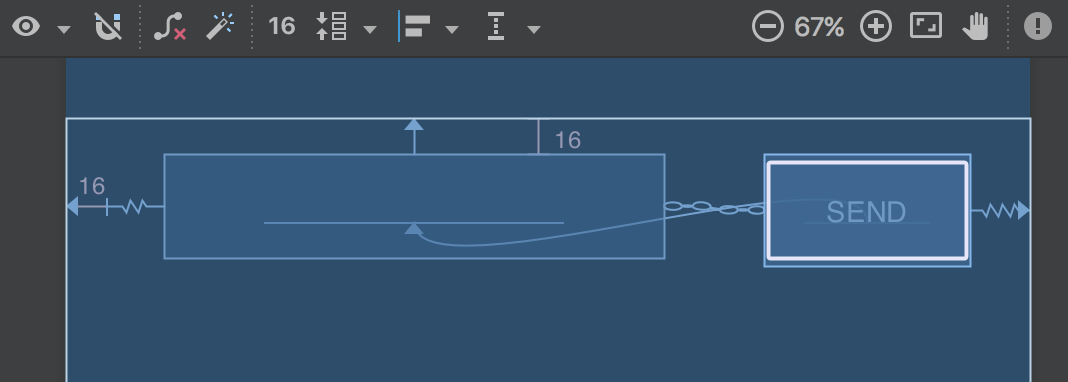
Figure 8. The result of choosing Create Horizontal Chain
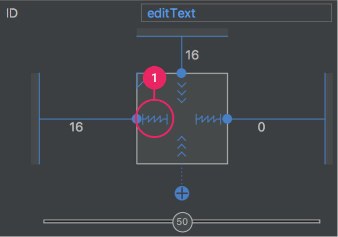
Figure 9. Click to change the width to Match Constraints
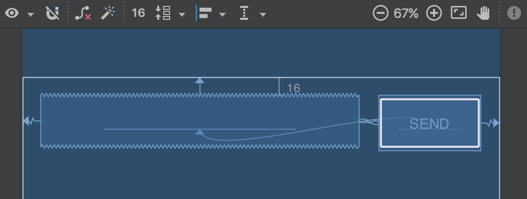
Figure 10. The text box now stretches to fill the remaining space
- Select both views (click one, hold Shift, and click the other), and then right-click either view and select Chain > Create Horizontal Chain. The layout should appear as shown in figure 8. A chain is a bidirectional constraint between two or more views that allows you to lay out the chained views in unison.
- Select the button and open the Attributes window. Using the view inspector at the top of the Attributes window, set the right margin to 16.
- Now click the text box to view its attributes. Click the width indicator twice so that it is set to Match Constraints, as indicated by callout 1 in figure 9. "Match constraints" means that the width expands to meet the definition of the horizontal constraints and margins. Therefore, the text box stretches to fill the horizontal space (after accounting for the button and all margins).
If it seems your layout did not turn out as expected, click below to see what your the XML should look like and compare it to what you see in the Text tab. (If your attributes appear in a different order, that's okay.)
For more information about chains and all the other things you can do with
ConstraintLayout, read Build a Responsive UI with ConstraintLayout.Run the app
If your app is already installed on the device from the previous lesson, simply click Apply Changes
 in the toolbar to update the app with the new layout. Or click Run
  to install and run the app.
The button still does nothing. To start another activity when the button is tapped, continue to the next lesson.
Reference:
https://developer.android.com/training/basics/firstapp/building-ui.html


Comments
Post a Comment